Michelle's Desktop VS. Mobile.
final task.
mobile layouts+pages
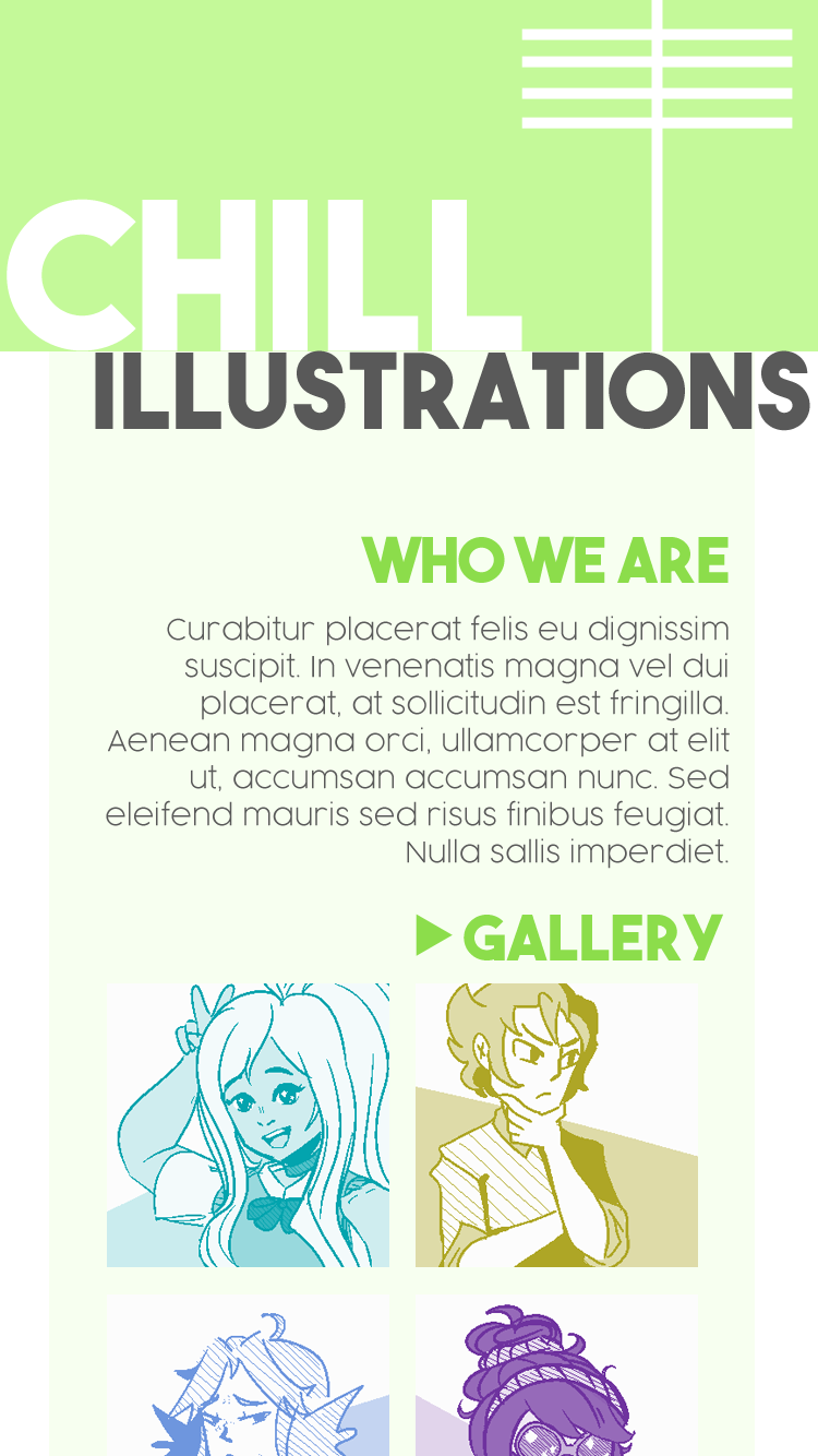
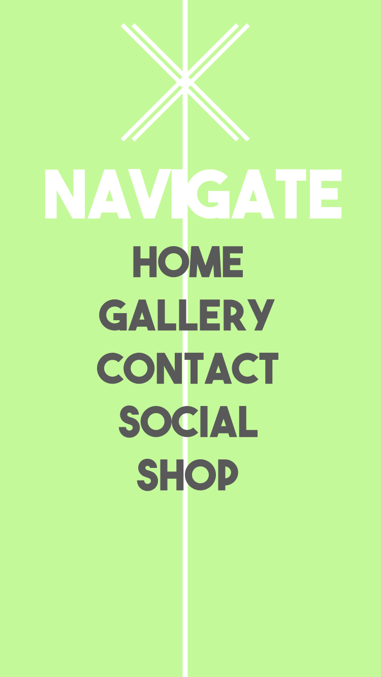
Above are examples of the homepage for the mobile layout of the website for "Chill Illustrations", a Toronto-based graphic design and illustration company. There are no events that require hovering, and everything is touch-based. For example, the gallery preview links to the actual gallery (an example of that page is below) and the hamburger-style menu button will allow the entire website navigation to appear for easy navigating. The font are big and bold, so that it's easier to read them on the smaller mobile screens without having to zoom in!
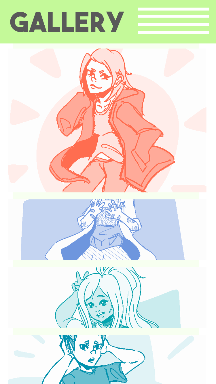
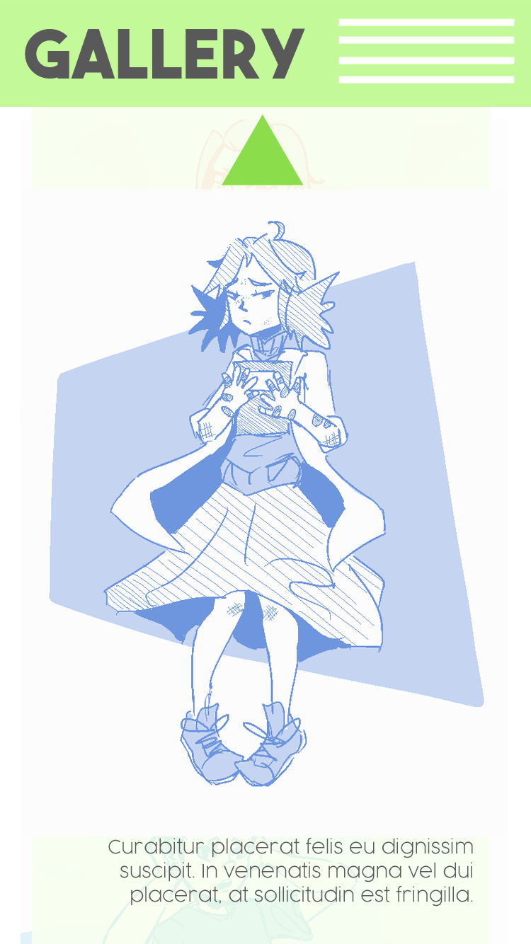
The layouts above are for a gallery-style page on the website. The system is, once again, touch based. Users can scroll down to see the previews of the art, and if they so desire, can click on a thumbnail in order to see a full-screen preview (with a short caption underneath) of the illustration. In order to go back, all they would have to do is click away from the photo, or, click the green arrow on the top (which is a recurring theme in navigation in this website's design).
desktops layouts+pages
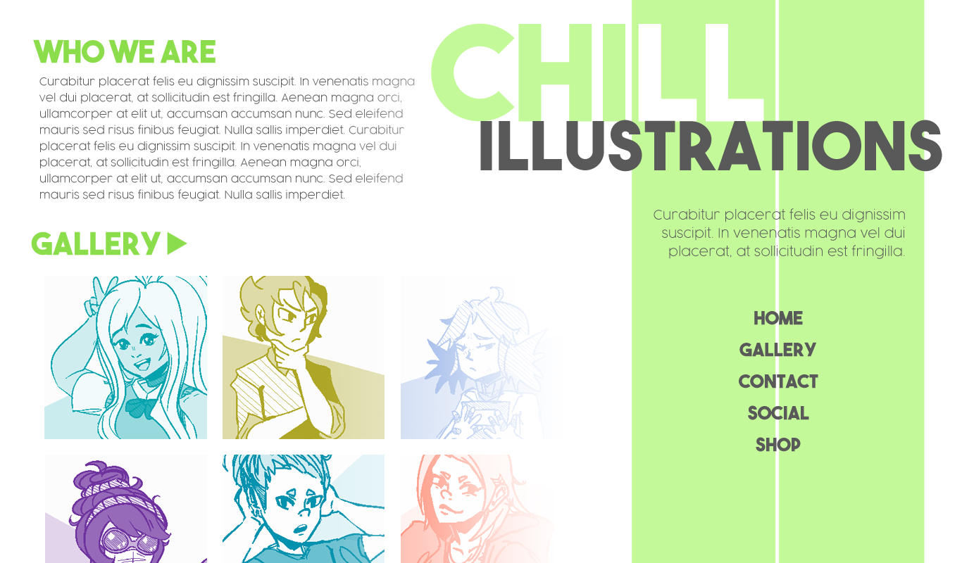
Above is the main desktop page. It features a navigation in the sidebar, and a little bit of content, as well as a preview of the gallery.
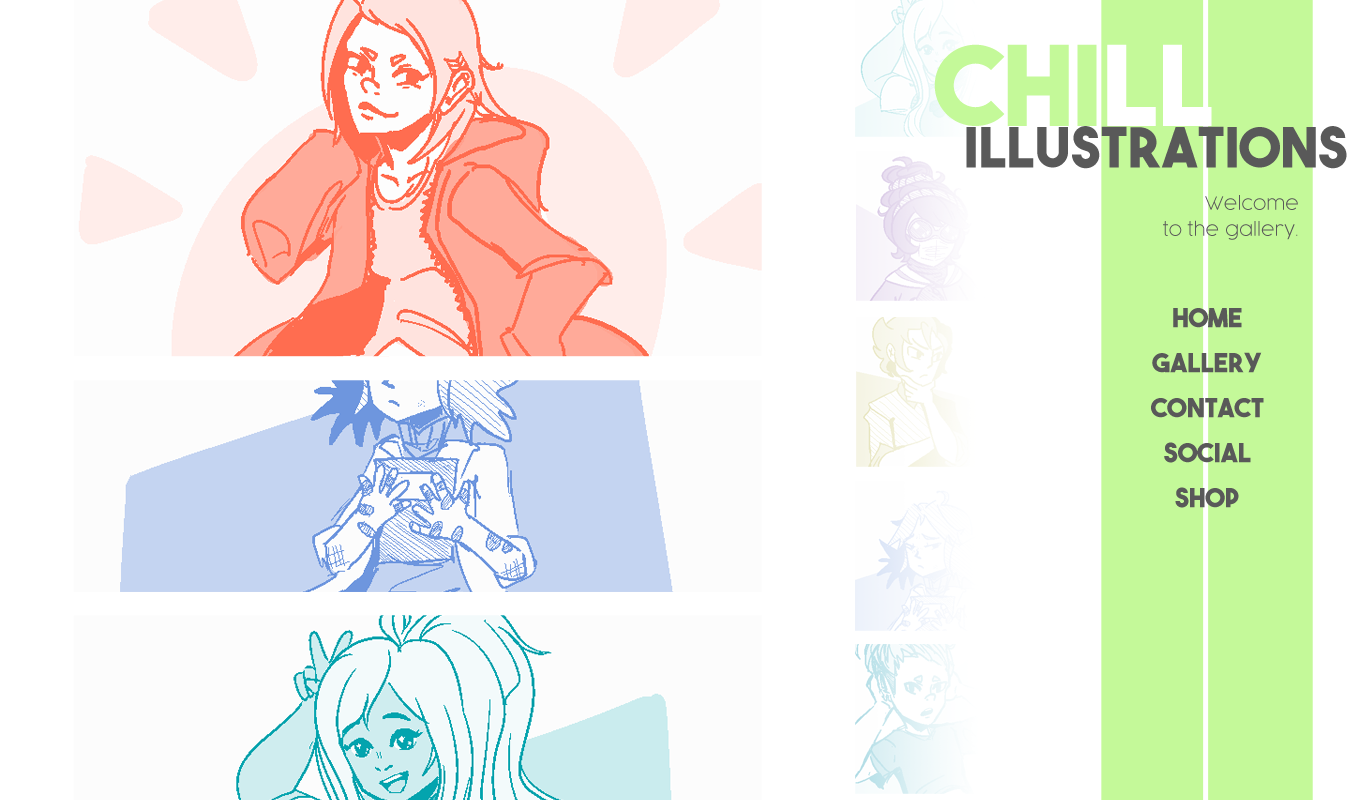
Following the link to the gallery page, one can see that it's very reminiscent of the mobile gallery layout. There are mini-previews on the right side of the gallery, which will scroll with parallax. Users can click on the images to enlarge them, similar to the mobile layout. The sidebar collapses slightly in order to create more room for the gallery.