Michelle's Wireframes
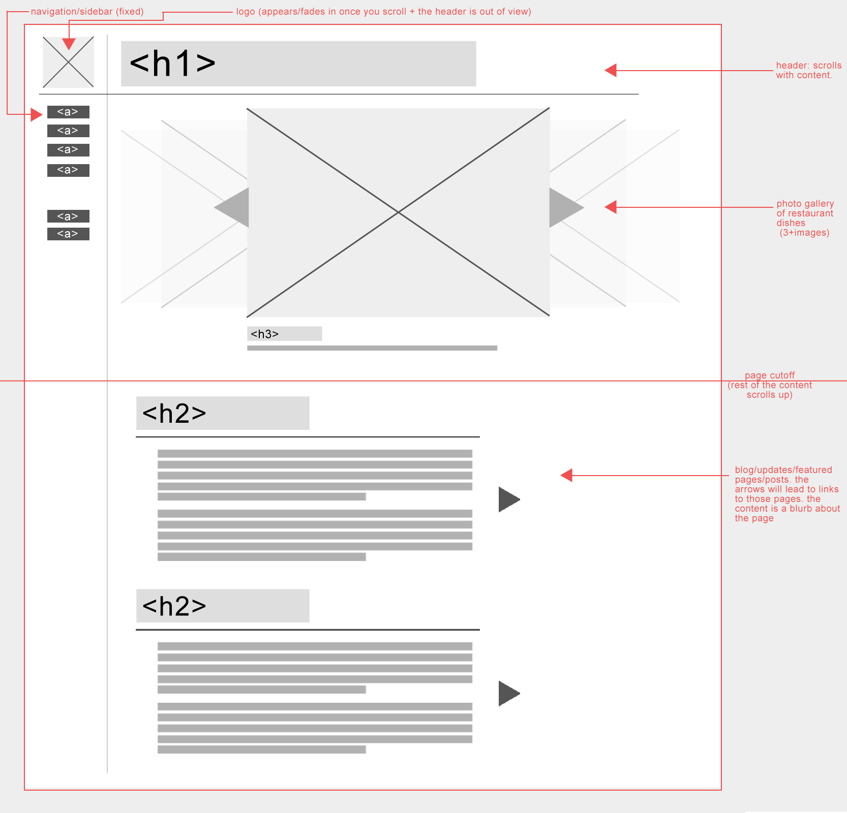
Desktop Wireframe

For the slideshow, I would use images of the menu items of the restaurant. The scrolling gallery is the first thing they see, so bringing in the attention of the viewer with the one thing that they are looking for at the restaurant will pique their interest. I would use simple and elegant colouring, most likely a dark theme with light accents, in order to make the images appear as if they are under a spotlight. I would use solid background as to not distract from the main attraction of the images. The fonts would be clean and elegant, once again, to not distract from the information and visuals.
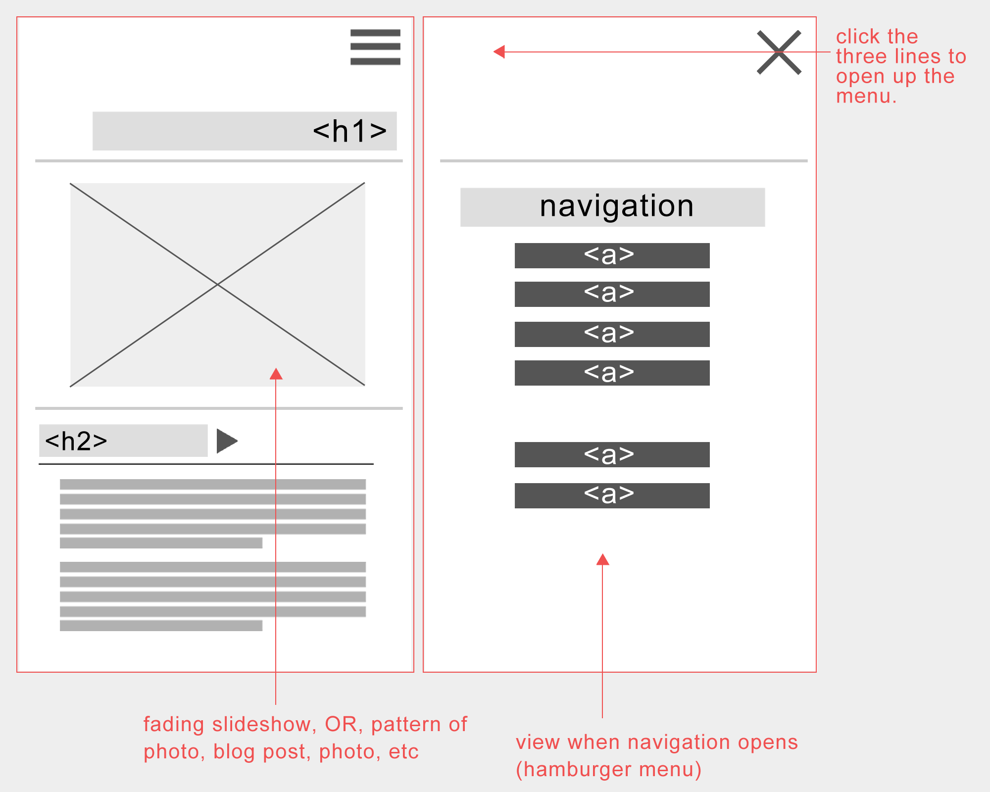
Mobile Wireframe
